Looking for a new logo and launch your own brand, but feeling a bit lost on where to begin? No worries, moodboard to the rescue! Today, we're going to chat about how moodboard can be your secret weapon during the design process. So, grab your favorite beverage, get comfy, and let's dive in!
What's a Moodboard?
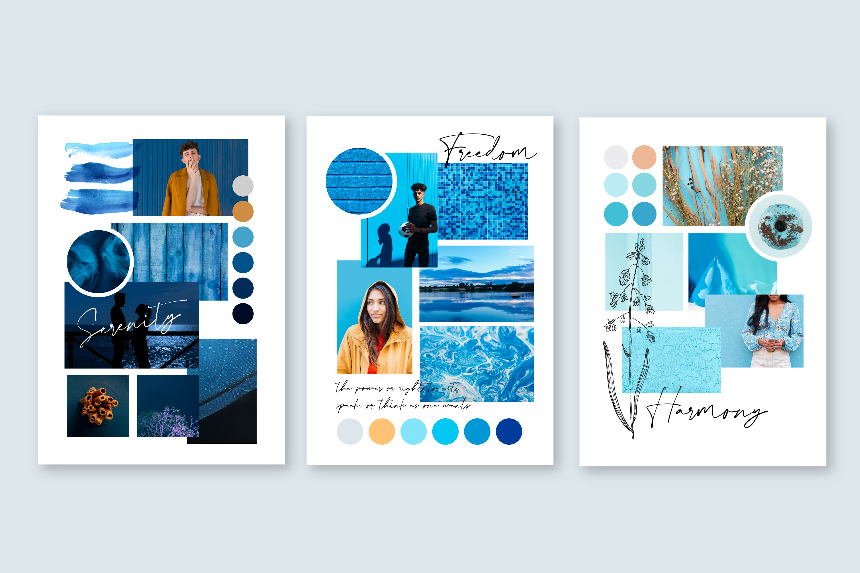
You know when you used to make collages as a kid? Well, a mood board is kinda like a grown-up version of that for your brand. It's got all sorts of stuff like colors, fonts, pictures, textures, and patterns that show off your brand's vibe. Think of it as the creative base that lets you see what your brand's all about. Mood boards are super important when you're working on branding because they help keep everything consistent and make it way easier to share your ideas with clients or your team.
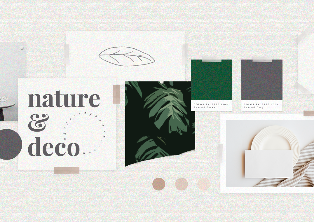
Examples of Mood Board Components
When creating a mood board, consider including the following components to represent your brand's identity:
- Color palettes: Choose a set of colors that represent your brand and evoke the desired emotions in your audience.
- Typography: Select fonts that reflect your brand's personality and are easy to read.
- Images: Include photos or illustrations that embody your brand's style, target audience, or industry.
- Textures/Patterns: Add textures or patterns to give depth to your mood board and convey a specific atmosphere.
- Inspirational quotes: Incorporate words or phrases that capture your brand's essence or inspire your design process.
- Competitor analysis: Showcase examples from competitors to help identify what sets your brand apart.
- Mockups: If you already have some design drafts, add them to the mood board for reference.
- Target audience: Include information or visuals representing your target demographic to ensure your brand resonates with them.
Some Great Mood Board Examples
To inspire your own mood board creation, here are a few examples for your inspiration:
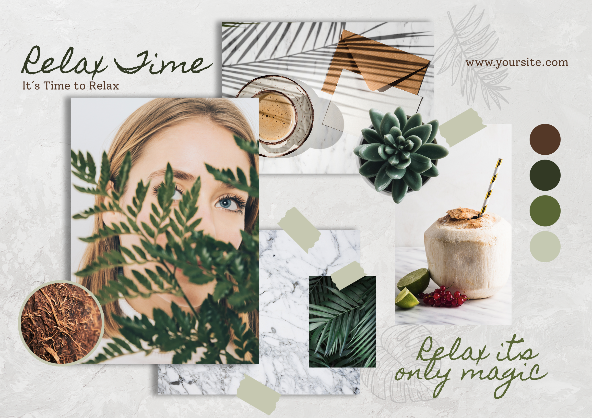
From this moodboard, you can see the combination of green leaves and cactus, coconut fruit and coffee, light marble texture, and tree textures, which convey a natural and earthy temperament. They evoke a sense of calmness, serenity, and grounding, bringing to mind images of nature, the outdoors, and organic elements. This moodboard provides a clear sense of the vibe and message the brand intends to convey.
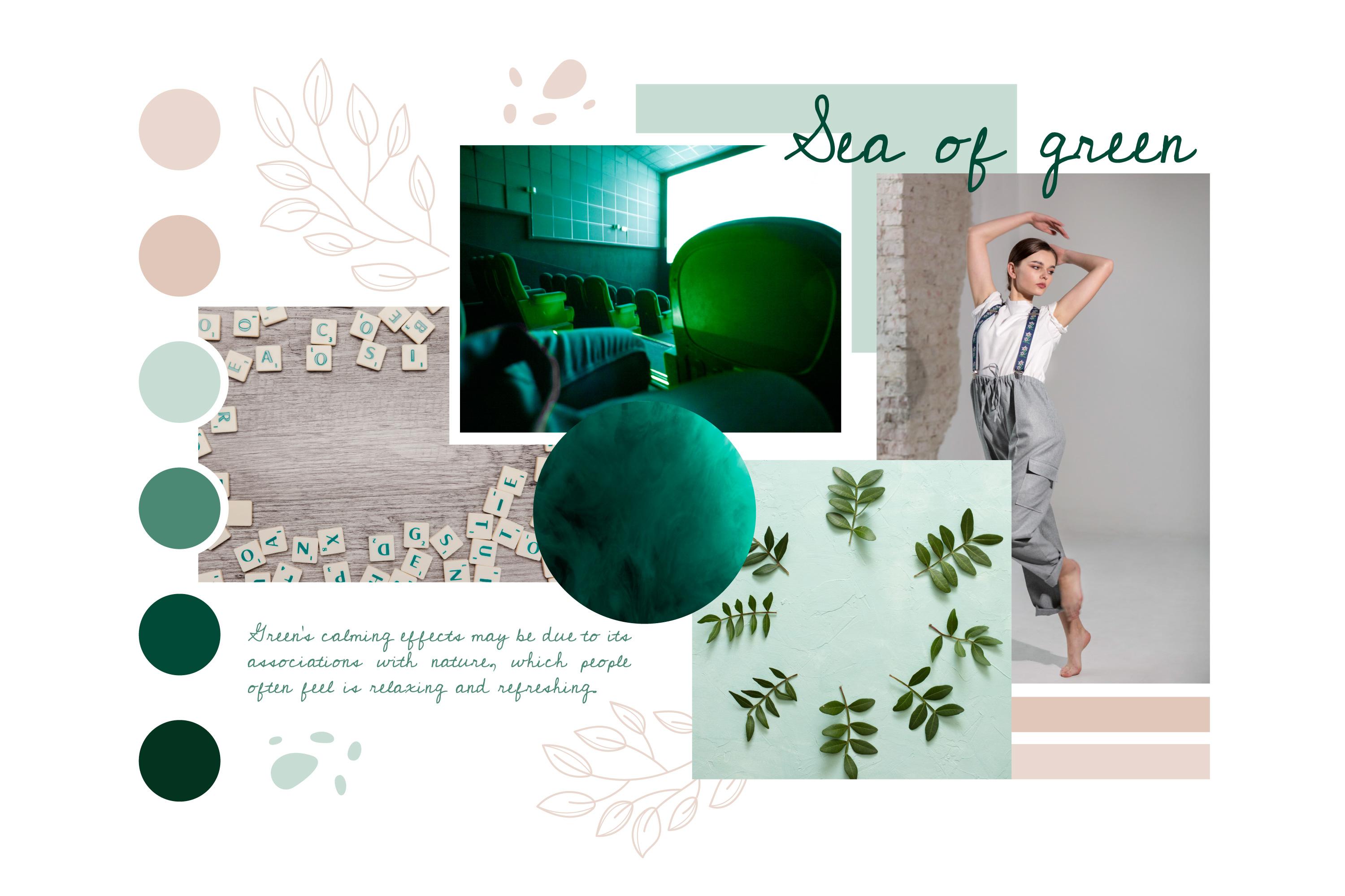
This mood board also features a lot of green hues, but this green color is more vibrant, indicating a desire to convey a fresh and lively vibe. Also the inclusion of the dancer and interior photos suggests a more modern feel. It appears that the brand is aiming to convey a contemporary aesthetic while still maintaining a connection to nature through the use of green tones.
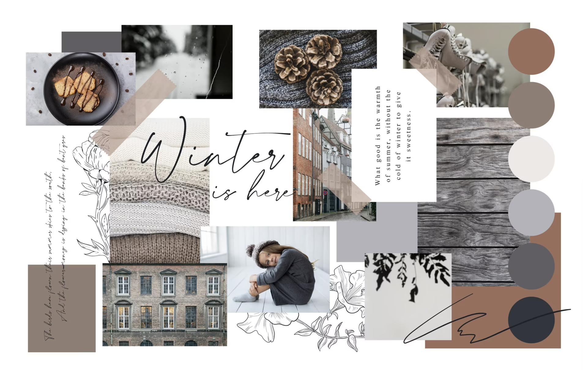
The combination of brown and grey color modes, along with the rainy day photo, ancient building, grey tree texture, and chocolate dessert, conveys a cozy and nostalgic mood. The brown and grey tones create a warm and inviting atmosphere, while the rainy day photo adds a touch of melancholy and reflection. The ancient building and grey tree texture evoke a sense of history and tradition, and the chocolate dessert adds a touch of indulgence and comfort. Overall, this moodboard conveys a sense of coziness and warmth with a touch of nostalgia and contemplation.
Conclusion
Incorporating a mood board into your brand design process can help you create a cohesive and compelling brand identity that resonates with your target audience. By drawing inspiration from successful moodboard examples, you'll be well on your way to make a logo like a pro that effectively represents your business's unique identity.

